Portland 
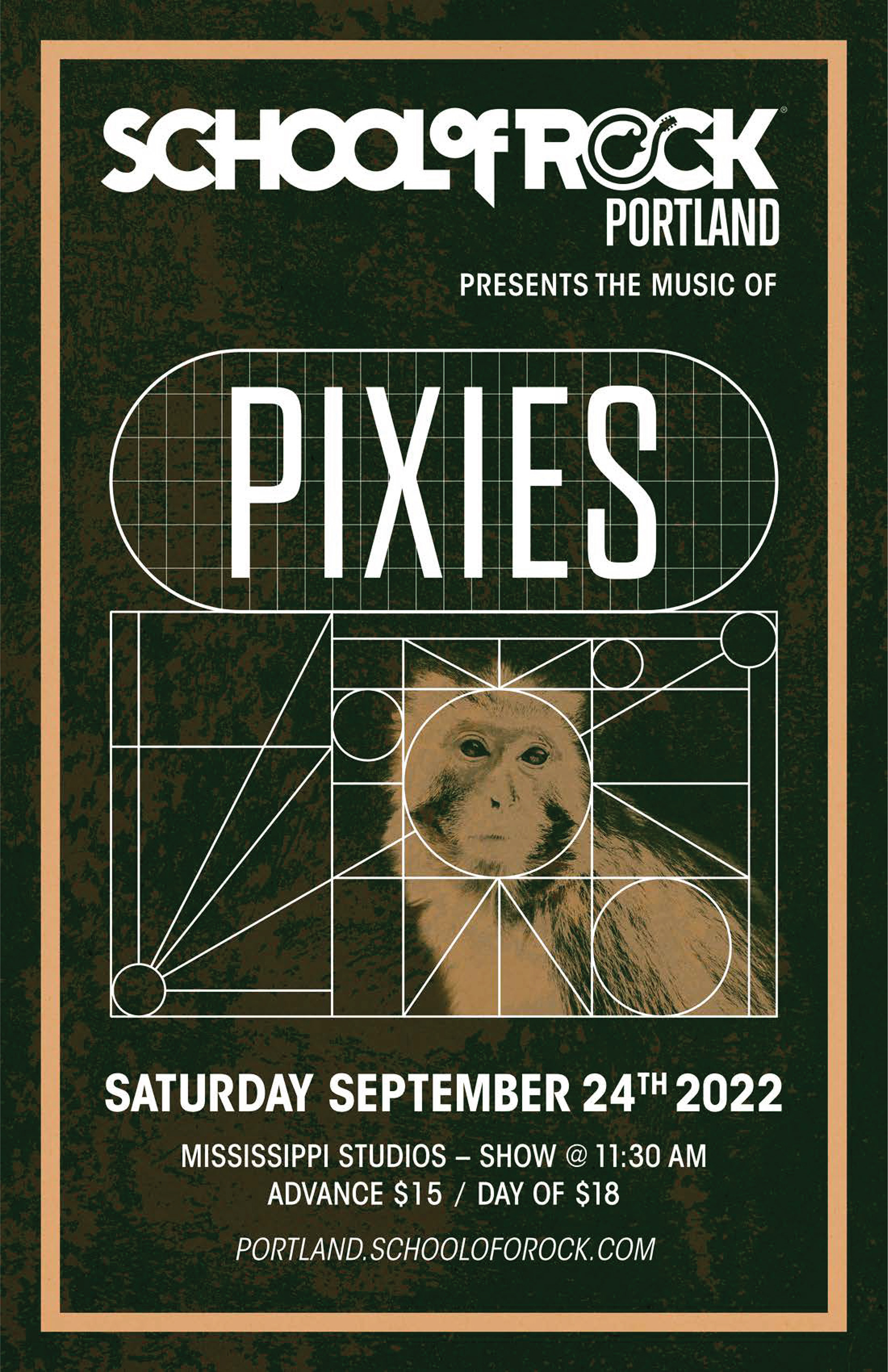
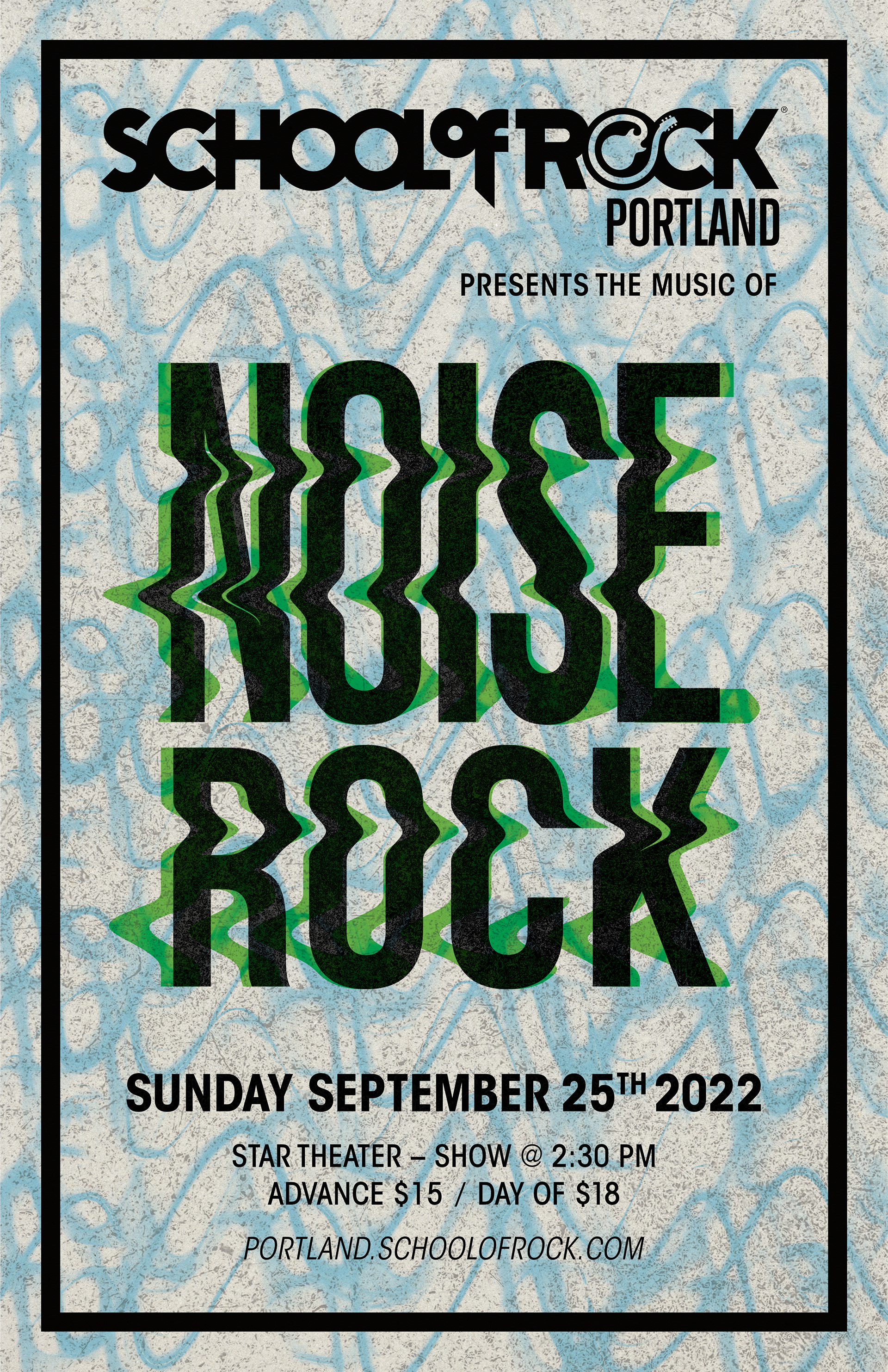
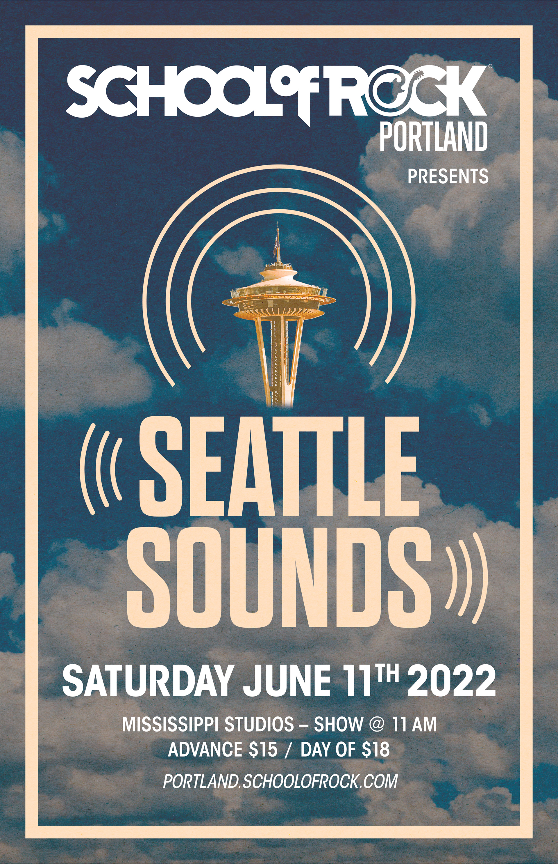
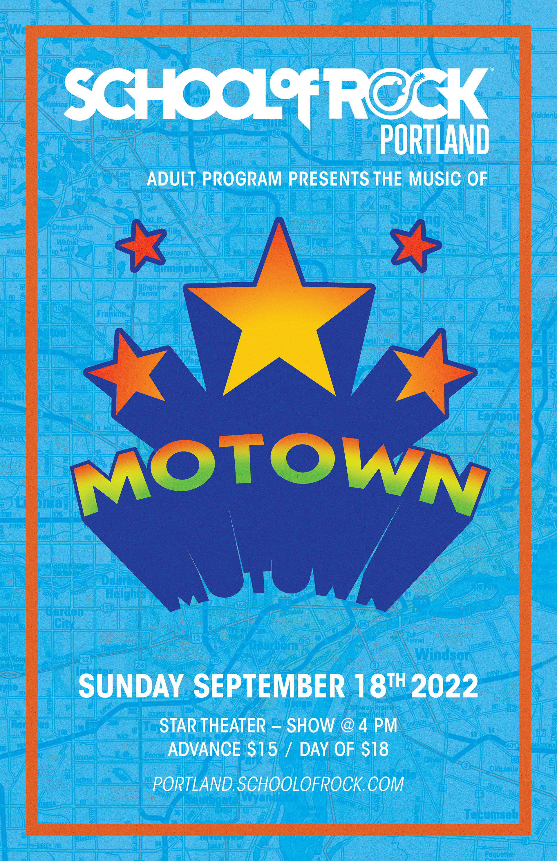
School of Rock Show Posters
Typography, Imagery
School of Rock is an afterschool program that specializes in music education for children and adults. With a performance based focus, students build confidence in musicianship and stage presences through live stage performances with fellow students. The program consists of weekly one-on-one lessons with instructors, and weekly band rehearsals.
With three seasons a year, the Portland School of Rock runs and promotes 10-14 shows a season resulting in a final performance at a local venue. All the posters here are ones I have designed for these shows.


The Challenge
Each show is dedicated to a specific artist, genre, or theme which must be reflected through the poster design, stay appropriate for all ages, and resemble the edge and sophistication of a traditional band poster. Due to copyright law, posters can not have any copyrighted material such as logos, images of artists, or other visual elements.


The Solution
With copyrighted imagery off the table, I focused on the typography, color schemes, and general visual elements to help convey the correct tone for each poster. I studied album artwork and promotional materials to identify the visual consistencies of an artist or genre, and then replicated the promonet tone and aesthetic in the piece. While this barrier was challenging, it pushed me to think more broadly around visual representation and develop a further understanding of the role design plays in producing tone and establishing genre.


